Often, architects and designers blind themselves with great gestures and shapes, so that the result of their work is the protagonist. However, the work of the good architect should be unnoticed, in the sense that when one enters a well-designed space, he should feel that that was the obvious solution, unable to imagine a better one.
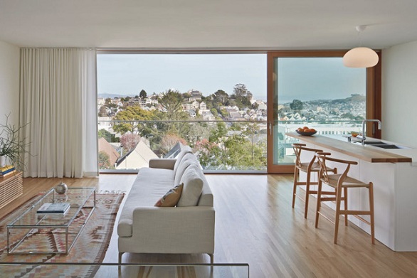
In this house in San Francisco, for example, the Ryan Leiddner Architecture studio decided that the views of the city would be the protagonists. We don’t know if these are the best views of San Francisco, but certainly the ones he has made the most of!
Without great architectural display, the house is a set of decisions that once taken seem evident, but in which exactly lies the great work of the architects: everything simply fits, and that’s a lot.
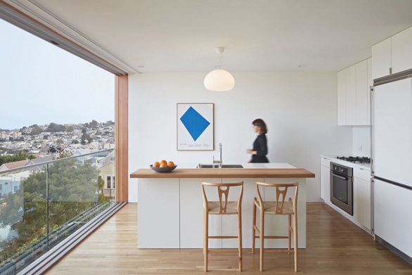
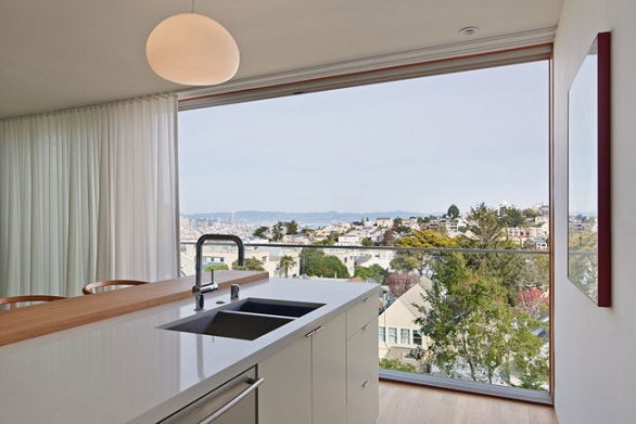
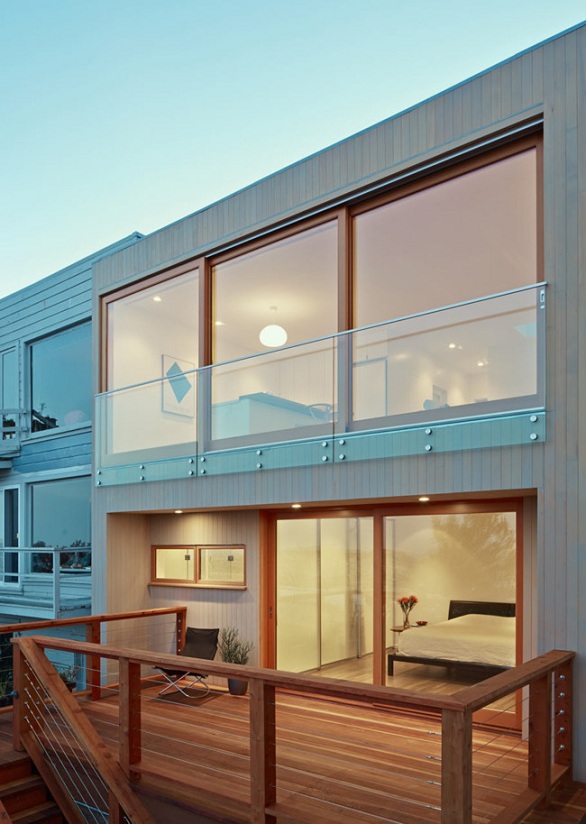
Starting with the eat-in kitchen, a space dominated by the imposing panoramic view of the hills of San Francisco, in turn fostered by the neatness of the opening. The feeling wouldn’t be the same if instead of the large window there were two windows, even if they were great. Thus, the house takes over the city, and the city over the house, so that the space, besides kitchen and living room, is also lived as a terrace.
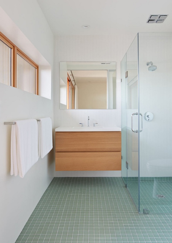
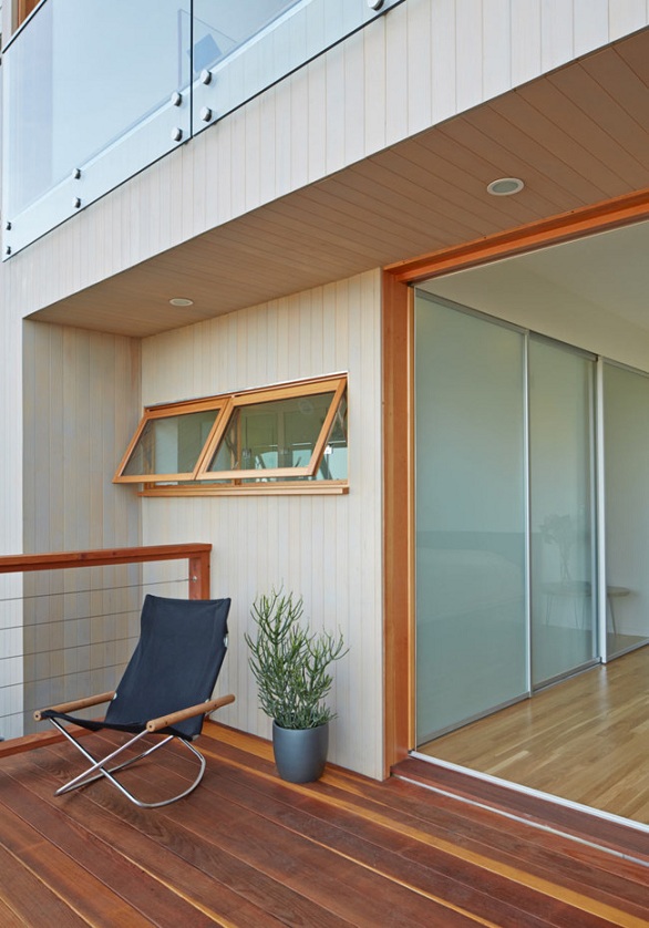
Downstairs there is a bedroom, a bathroom and a small wooden terrace. We particularly like that both the bathroom and bedroom take advantage of the outside light and views (each in a fair manner), but especially the small setback of the facade in this floor, which gives an extra privacy to these more private spaces.
It’s just a small gesture, you could even say it’s one meter of house that is lost, but with it we get to visually arrange the spaces, making that already from outside we notice a feeling of shelter in the bedroom and of amplitude in the lounge.
The choice of materials and colours also helps the house to, as a group, turn out to be harmonious: white and wood is a combination that rarely fails, and this is no exception, but we dare say that it is even a choice that fits perfectly with the shades of the landscape, completing a palette of colors at the same time vibrant and peaceful.
This house in San Francisco is not an ostentatious or flashy housing. A small wooden cube with large windows like those that can be glimpsed with it in some photos, but it’s all an example of architecture well done.

